UX Design & Product Case Studies
INTRODUCTION
Welcome to my product case studies page! In general, the studies highlighted in this section follow the process outlined below. Some follow this process more strictly than others. Due to legal restrictions, I am unable to provide visuals of the entire process; however, I have described, as best I can, the reasoning behind each case study. I also provide summaries for those who want to skim the material.
Design process generally used in each study:
- Define the problem: I, along with my team members, began by clearly articulating the problem we were solving and its significance.
- Understand the users and context: We identified the users, what they sought to accomplish, and how they currently used the product. We gathered insights through stakeholder interviews (sales, support, customer success, leadership), user analytics tools (e.g., FullStory, Canny, Sigma, Airtable), in-app surveys, and by creating journey maps.
- Conduct discovery and competitive research: We then explored how other products solve similar problems. We documented patterns, ideas, and inspiration using reference collections and mood boards, including competitive product walkthroughs and demos.
- Design low-fidelity solutions: After the discovery phase, we created sketches and wireframes that addressed key use cases. We then reviewed these wireframes with product team members and technical leads to ensure alignment with company heuristics and design systems.
- Iterate and test: We would validate our designs through user testing with wireframes, high-fidelity mockups, or clickable prototypes, and refine our mockups based on the feedback.
- Align with stakeholders: Once we had a clearer understanding of what was working and what wasn't in the designs, we presented refined designs to key stakeholders, incorporated their feedback, and finalized the designs for development.
- Prepare for development: Product designers on my teams frequently created JIRA tickets and documentation to guide implementation, including developer-ready design references.
- Support implementation: Throughout the development phase, we collaborated closely with developers during sprints to ensure designs were implemented as intended and the final code met the original goals.
- Product test: For larger projects, we would release the updated product to a limited group of external users to gather usability feedback, test functionality, and identify and fix bugs.
- Measure the results: Once the code was deployed, we would measure the results through in-app surveys, analytics tools, and follow-up interviews. This was done to measure user response to the updated product and inform future roadmap decisions.
Here are the case studies:
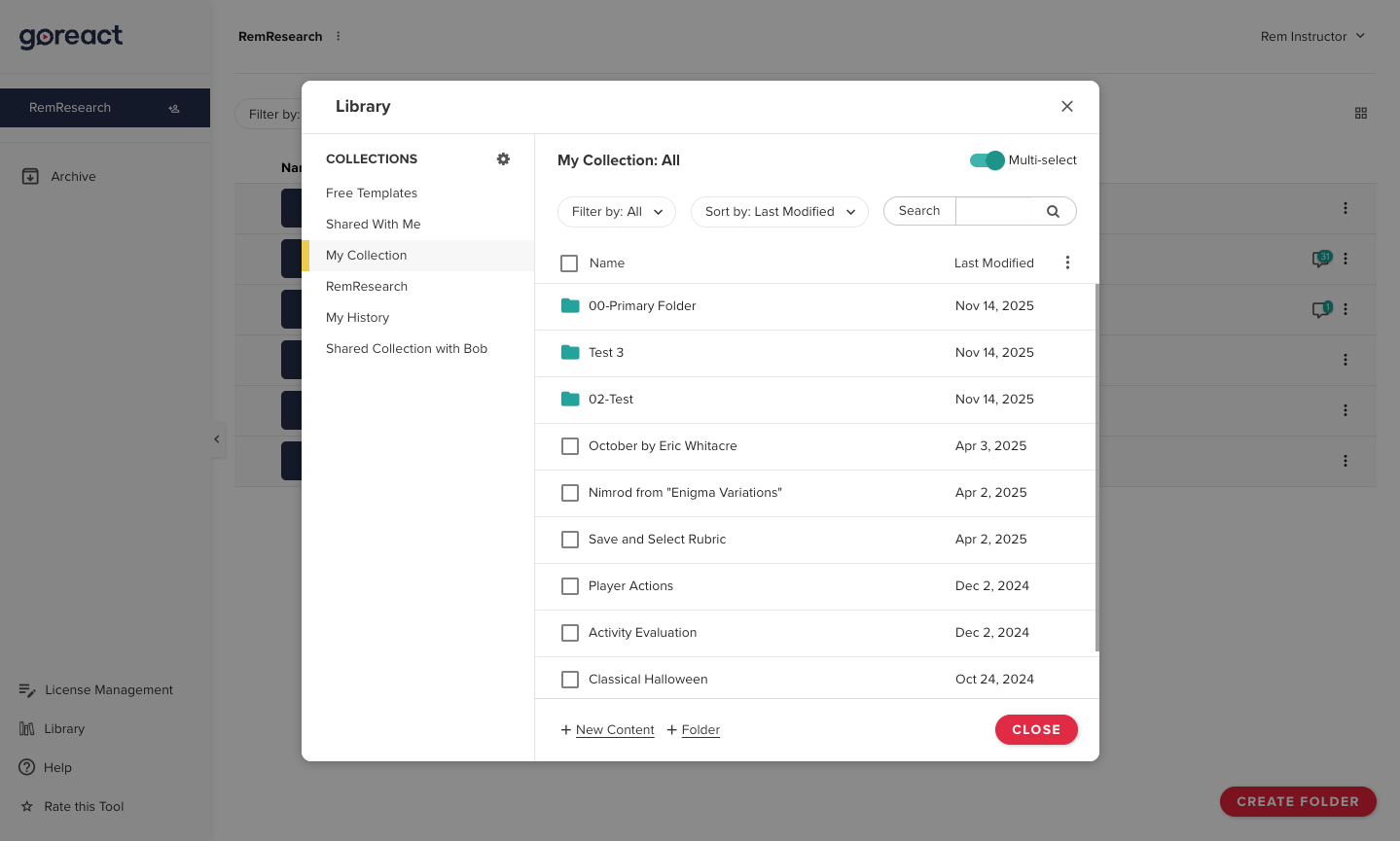
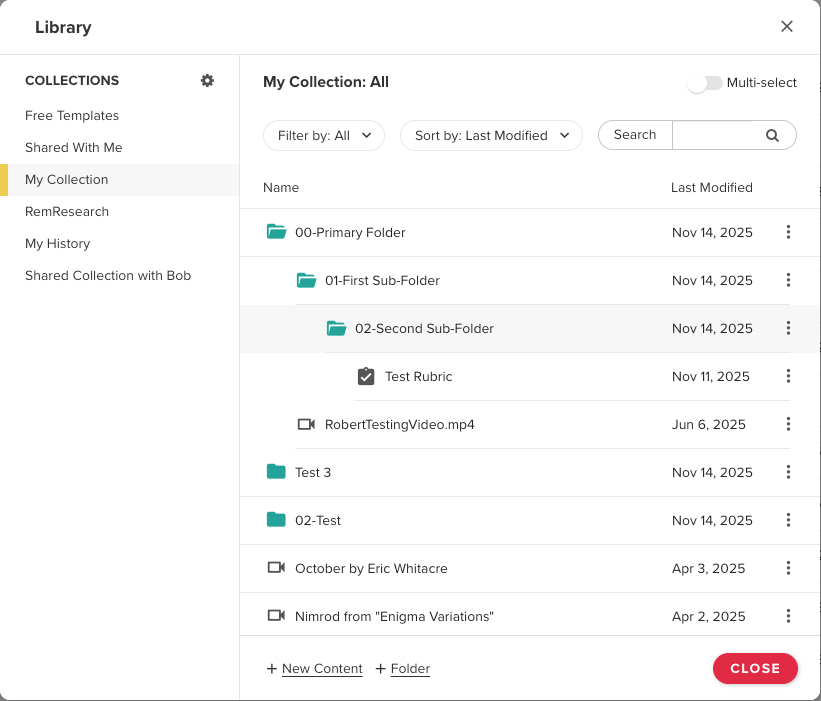
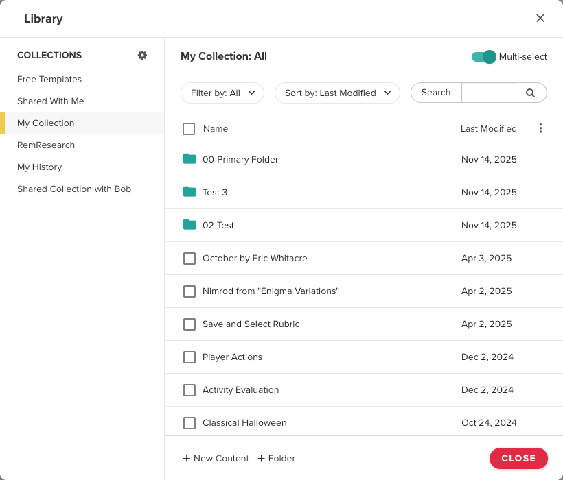
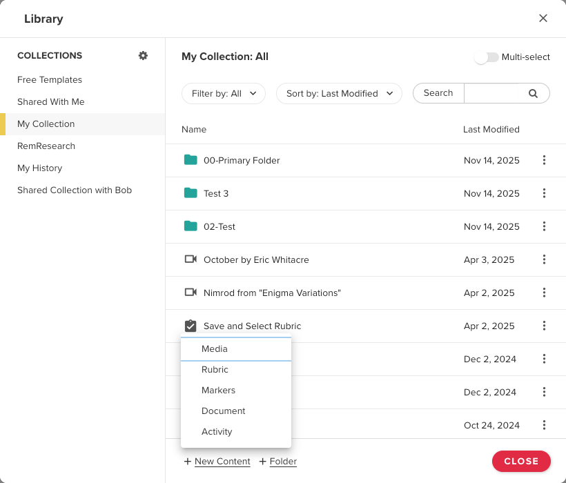
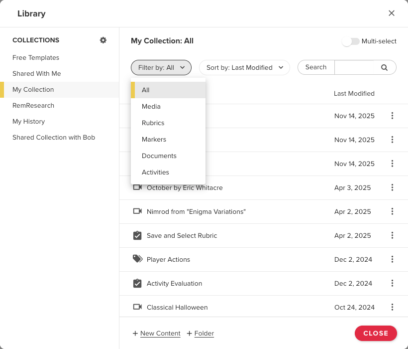
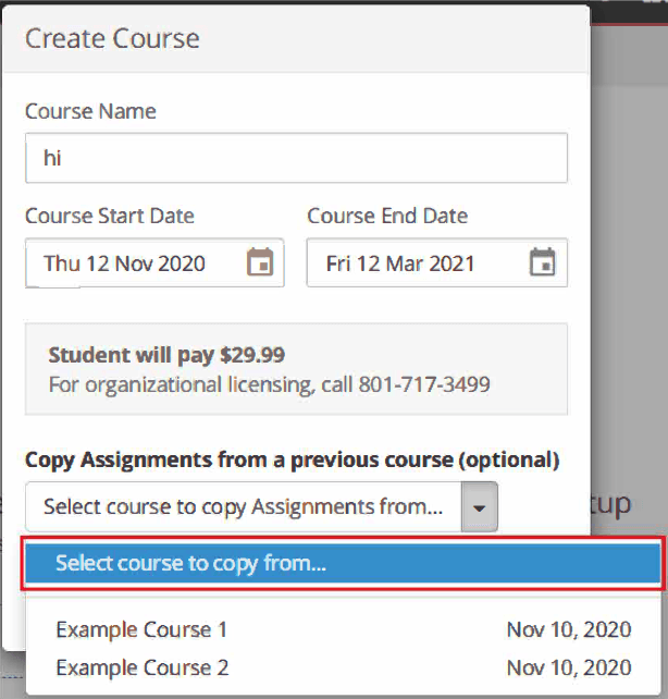
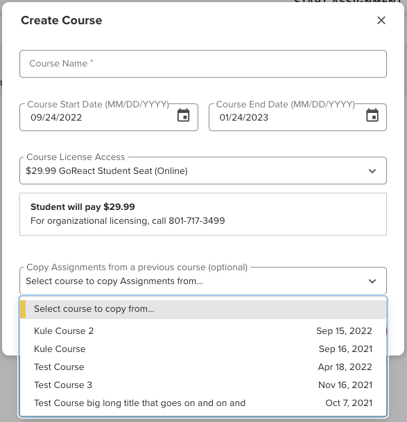
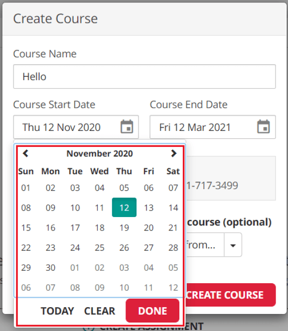
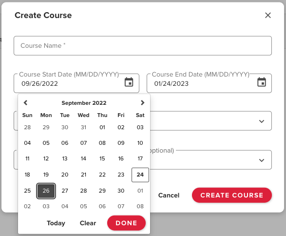
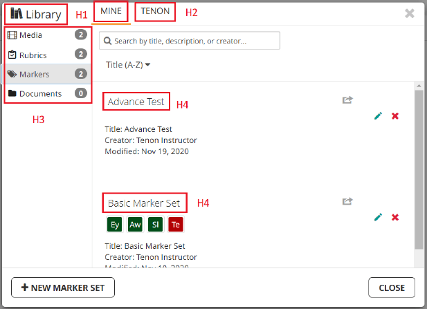
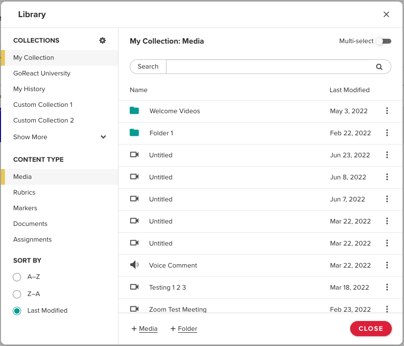
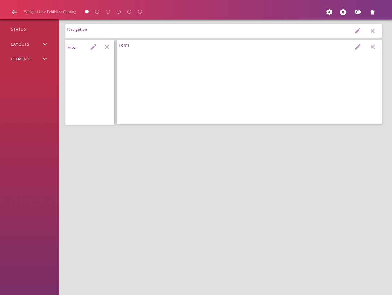
GoReact Library
Summary
- Problem: The existing library was confusing, inefficient, difficult to organize, and lacked reliable sharing and search capabilities.
- Goal: Create an intuitive, easy-to-navigate library for storing, finding, sharing, and reusing content.
- Role: Product designer responsible for redesigning the library.
- Process: Reviewed user feedback, collaborated with product and engineering, and iterated from wireframes to tested high-fidelity designs. Also, since GoReact is a progressive web application (PWA), all designs were optimized for both desktop and mobile views.
- Outcome: A centralized, powerful library that supports easy organization, reuse, sharing, and cross-account content management.
What was the problem to be solved?
GoReact is a video assessment and feedback platform built to help learners master skills. In addition to video recording and assessment tools, the GoReact application provides a library that serves as a central hub for managing and organizing video content and learning resources. Users can store, access, reuse, and share videos across courses and assignments without re-uploading content. The old library was confusing and inefficient. Organizing files was difficult, sharing saved media with others didn’t always work properly, and there was no search capability, making it hard for users to find files. Our product team wanted to make the library easy to navigate, easy to share files with others, and a useful place to save documents that could be reused as many times as the user desired.
What was my role on the project?
I was the product designer assigned to reimagine and redesign the library.
What was my design process?
The project started with an analysis of the old library. We identified what was not functioning and then defined the ideal library's capabilities. We did this by reviewing issues submitted by users to our support team and in-house employees' conversations with various clients. Once we had a fairly clear picture of what we wanted the library to do, I began creating wireframes to show the project's product manager and our lead developer, who could provide insight into the project's technical limitations.
We iterated on these concepts until we felt we had worked through the primary personas and their user journeys, and had developed a strong solution from which I could create high-fidelity mockups to test with users and present to other key stakeholders in the business. After these presentations, we again iterated on the results of our user testing and key stakeholder feedback. Once the final mockups were created, our product manager could write up JIRA tickets for the developers to work on. Since GoReact is a progressive web app that supports a single codebase for desktop and mobile, all designs accounted for both views.
What was the outcome of the project?
The project delivered a feature within GoReact that provided users with a central hub to manage and organize their video content and learning resources. Over time, the library has become one of the most powerful features of the application, enabling users to store, access, reuse, and share their videos across courses and assignments without re-uploading content, and to create reusable templates and connect content across multiple personal and organizational accounts.
Making GoReact AccessiblE
Summary
- Problem: The product failed to meet WCAG and higher-education/government accessibility requirements.
- Goal: Achieve verified accessibility compliance across the application.
- Role: UX designer leading accessibility design solutions.
- Process: Applied WCAG standards, redesigned and tested accessible interactions, and iterated through audit feedback with engineering. All designs were designed for both desktop and mobile views.
- Outcome: Reached compliance, established company-wide accessibility standards, and unlocked additional higher-education contracts.
What was the problem to be solved?
GoReact’s video feedback application did not meet the accessibility requirements for higher education, government, and WCAG. This put GoReact at risk of failing to meet its contractual obligations with many higher education and government institutions. GoReact engaged Tenon.io, an external firm, to conduct an accessibility audit of the GoReact application. Tenon.io helped GoReact create a VPAT to identify areas in the application that needed to be changed. This VPAT would become an accessibility conformance report that GoReact could use to verify that its product is compliant with higher education, government, and web accessibility standards.
What was my role on the project?
I was the UX designer assigned to find solutions to the accessibility problems identified by Tenon.io.
What was my design process?
After receiving the list of accessibility problems from Tenon.io,
A product manager and I began researching the Web Content Accessibility Guidelines (WCAG) published by the W3C. As we discovered the best practices from WCAG, I began mocking up solutions for our product in Adobe XD that conformed to these guidelines. The problems we were addressing included: keyboard tabbing paths; aria patterns for JAWS, NVDA, and VoiceOver
screen readers; icon and text color contrast; tooltip and icon focus states; application zooming capability for users with vision impairments; using the product in high-contrast states, such as Windows High Contrast mode; keyboard drag-and-drop capability; and designating clear heading and landmark regions for faster assistive technology navigation. Once we had several design solutions, the product manager and I scheduled interviews with GoReact users with accessibility needs. We had these users test our designs and provide feedback on what worked and what didn’t. Based on this feedback, we revised the designs, documented developer requirements, and implemented the changes in the product. We then had Tenon conduct follow-up audits of the GoReact software until our accessibility conformance report met the standards required by many higher education and government institutions.
What was the outcome of the project?
As a result of this project, the product manager, technical lead, and
I created company-wide accessibility standards that all designers and developers at GoReact would follow and apply to existing components, so the development team would not have to continually relearn them. The company also secured additional contracts with higher education institutions that are legally required to purchase software that meets specific accessibility standards.
Add a Title
An example of the original dropdown colors and design which were not friendly to accessibility
Add a Title
The new dropdown took into account the WCAG 4.5:1 contrast ratio standard for 14pt text
Add a Title
The old onboarding tours had color contrast issues and issues with tab order
Add a Title
The new onboarding tours took into account color contrast as well as tabbing order
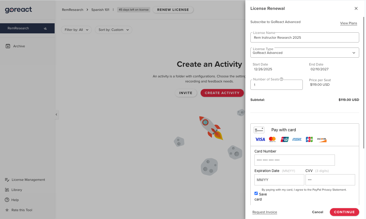
GoReact Payment/License Side Panel
Summary
- Problem: Learners had no in-app payment option, relying on manual, unscalable payment methods.
- Goal: Create a simple, reliable in-app payment flow for learners.
- Role: UX designer leading the in-app payment experience design.
- Process: Researched payment patterns, designed and tested wireframes and mockups, collaborated cross-functionally, and released incrementally with analytics. All designs were designed for both desktop and mobile views.
- Outcome: Launched self-serve in-app payments, reducing sales friction and enabling future licensing features.
What was the problem to be solved?
GoReact did not have a way in the application for learners to pay for the product. It was free for instructors to use but once learners were invited to the product they had to use a code given to them at a bookstore or contact an in-house team that would handle payment for use of the product. This was not a scalable situation and the business wanted to figure out how to allow learners to pay for the product as they created their accounts.
What was my role on the project?
I was the UX designer responsible for figuring out how to bring users through the in-app payment process.
What was my design process?
I first had to understand how in-app payment worked in other applications and how those concepts could translate to GoReact’s situation. After researching several different applications online and applications our business had licenses for, I then began to draw out concepts on paper and translated those to wireframes. Since I was also the product manager at the time, I had another product manager and the technical lead of the project review these wireframe concepts with me and then we began to test them with different users. This was done through interviews using Zoom and Google Meet. After about 10 interviews we had a fairly good idea of concepts that were working and concepts that were not. I iterated on the wireframes and began creating higher definition mockups to show our internal stakeholders.
With a few iterations of the higher definition mockups and after consulting with the internal stakeholders we were ready for the project to go into production. I wrote up the JIRA tickets and the work began with the developers. We withheld the feature from our users until we felt we had all of the concepts in place and we had thoroughly tested the payment form. The correct functioning of this feature was particularly important since it dealt with financial transactions. When we released the feature we did so only to a small number of users so that we could make sure all of the payment processing worked as intended. Our company had daily deployments and weekly sprints which allowed us to pivot very quickly when we released features because we could see through the use of Fullstory, an analytics application to help teams understand user behavior, and through follow up interviews, how users were interacting with the feature. When we felt the payment form consistently performed as it should with our small test group, the feature was then released to our entire user base.
What was the outcome of the project?
GoReact, the business, was thrilled to have a way for learners to sign up and pay for the product without having to contact the sales team. The ability for users to pay for the application as they used it paved the way for implementing licensing through the application as well.
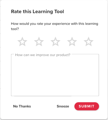
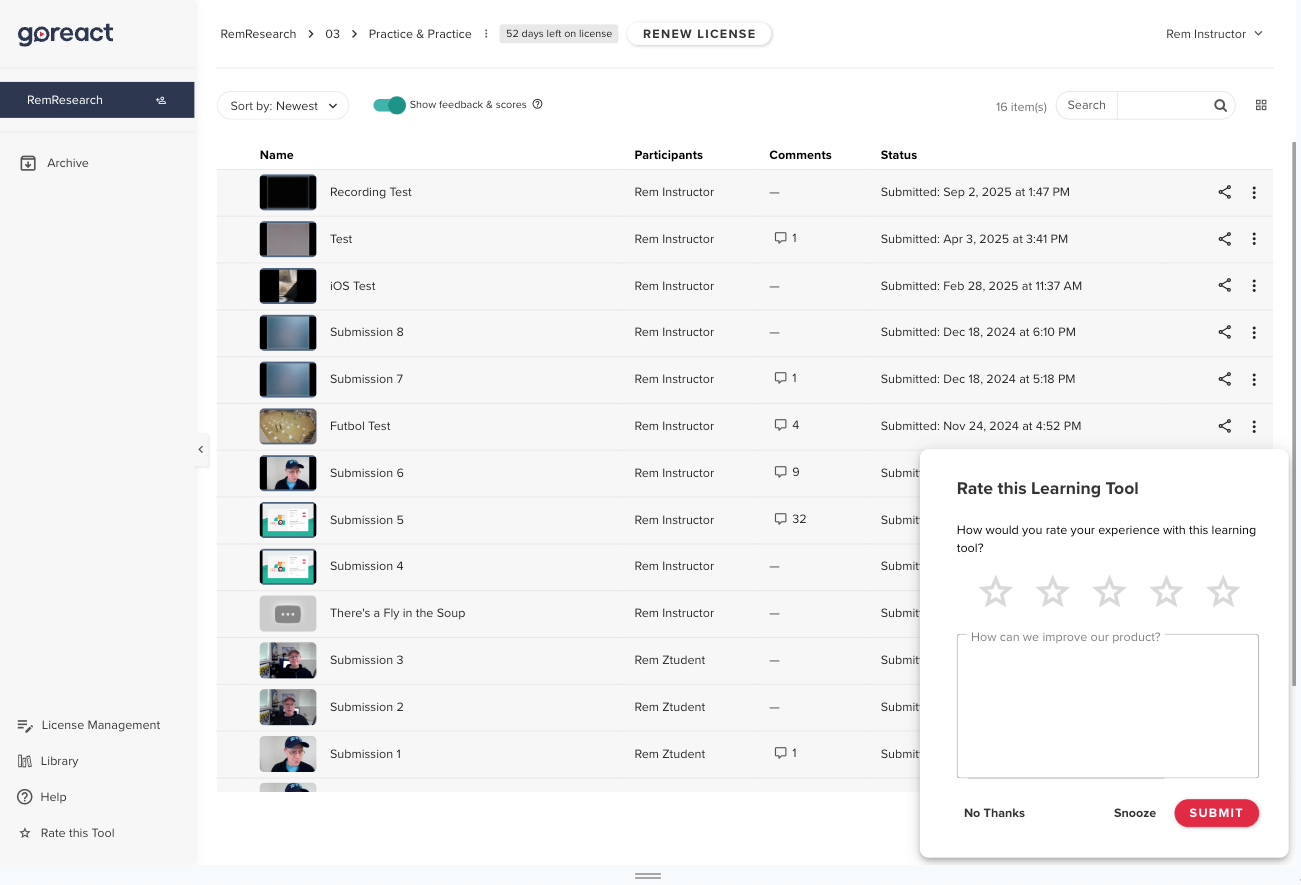
GoReact In-App Survey
Summary
- Problem: The team lacked a direct way to understand user sentiment and feedback at scale.
- Goal: Capture real-time, in-app user feedback with minimal disruption.
- Role: Product designer responsible for survey design, categorization, and analytics integration.
- Process: Designed a simple modal, defined feedback topics, tuned survey cadence, and connected responses to Airtable, Sigma, Slack, and Fullstory. All designs were optimized for desktop and mobile views.
- Outcome: Delivered continuous, actionable user insights that informed faster and better product decisions.
What was the problem to be solved?
The product team at GoReact struggled to understand how our users felt about the product and what ideas they had to improve it. We used another application called Fullstory to gain insight into our users' journeys through GoReact and we had users communicating with our support team through Zendesk but we still didn’t have a good way for the product team to directly communicate how our users felt about the product. We decided the best way to allow our users to communicate how they felt, was to display a modal with an in-app rating scale and an open ended question asking our users how we could improve our product.
What was my role on the project?
I was the product designer responsible for designing the in-app survey and worked closely with one of our product managers to integrate the survey responses with Airtable, a cloud-based spreadsheet/database and Sigma, a cloud-based business intelligence and analytics platform that could help us visualize the data through charts and graphs. I was also responsible for generating a list of topics that we could use to categorize the user responses being generated from our open ended question. These topics would allow us to see which areas of the application users were struggling with and give us a searchable database that we could filter to see all responses related to a specific topic.
What was my design process?
Since the modal was a relatively simple part of our application, the design of it followed other modal patterns in our product and didn’t require major UI design work. Where most of the product design work was focused, was thinking through how to categorize the open ended responses we would get from the question we were asking. We wanted the question to allow for a wide range of responses so we could capture the sentiment of the user in a particular moment. We weren’t trying to capture a net promoter score, we were trying to gauge how the user felt in the moment and give the user an opportunity to share ideas they might have on how to improve the product. We decided the best way to categorize the open ended responses was to allow the modal to appear in the product and collect several hundred responses. The modal appeared once the user entered the feedback panel of our product after a certain number of times. We didn’t want the modal to appear too many times so it annoyed the user but we also didn’t want it to appear too few times so that we would miss out on how the user felt about the product at a particular time.
We adjusted the cadence as we started getting feedback, and we eventually landed on a cadence that seemed to give us the quantity of data we wanted without being too annoying to the user. Initially I would manually categorize the data but we eventually had enough topics that we could instruct an AI assistant in Airtable to look for the topics for us. Topics that came up that didn’t fit what we already had were not labeled by the AI and gave us a chance to review them and either manually assign a category or create a new category. We also spot checked the AI’s categorization just to make sure it was categorizing the responses correctly. We had to adjust the prompt we gave the AI a few times to get it to function as we wanted but eventually it was categorizing the open responses in a fairly accurate manner. The data gathered in Airtable was also fed to Sigma, a visualization tool, which allowed us to see through a series of charts the percentage of users whose responses fell into a specific category. The categories with the highest percentage and the lowest number of stars were the ones we mostly focused on to determine which areas of the application needed the product team’s attention. We also fed this data to a Slack channel which would alert us when a new open ended response was given in the application. This channel also captured the Fullstory link so in the moment the response came in, we could immediately replay the user journey and experience that had been captured by Fullstory. This would allow us to immediately see what the user was struggling with and therefore allow us to create JIRA tickets in a timely manner to fix the problem if we determined the problem was something we could fix quickly.
What was the outcome of the project?
This project gave us incredible insight into the day to day sentiments and experiences of our users. Granted it was only looking at users who were courageous enough to leave us a response but this was at least better than only communicating with users who allowed us to interview them or test them. It greatly increased the pool of users we were hearing from in a way that was relatively non-intrusive and could be done when it was convenient for the user.
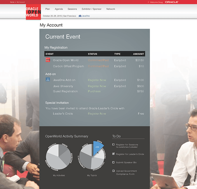
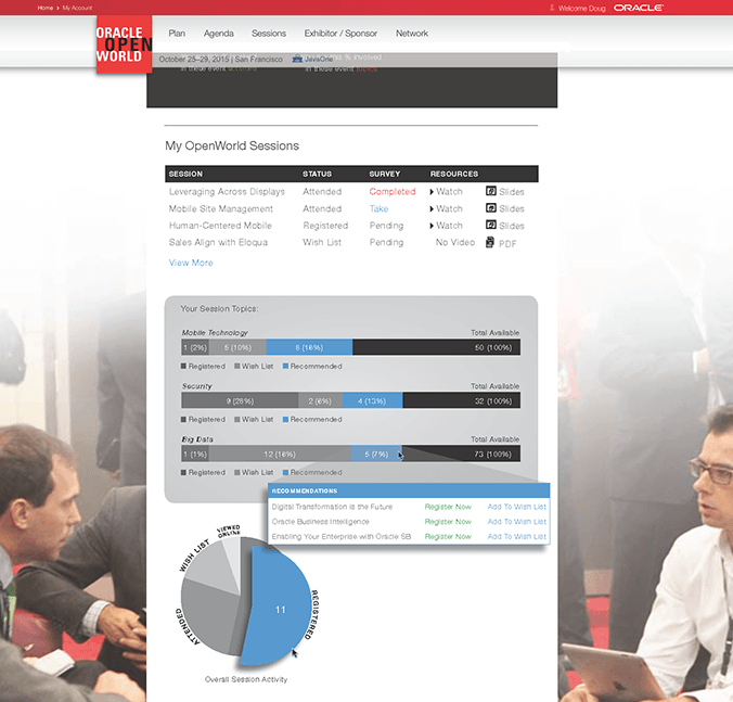
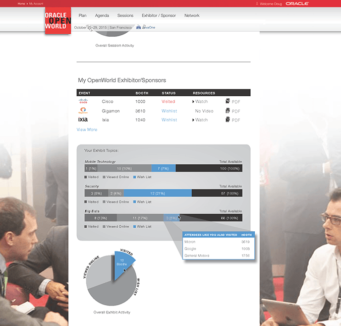
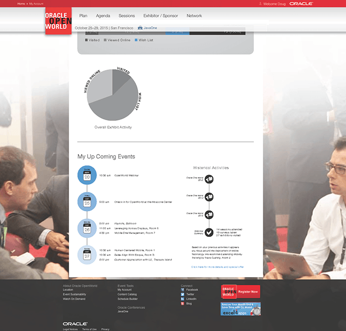
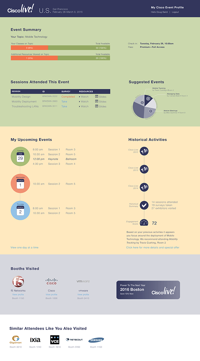
RAINFOCUS MY ACCOUNT MOCKUPS
Summary
- Problem: RainFocus needed client-ready visuals to explore embedded attendee data experiences.
- Goal: Design modular, customizable attendee pages for event managers.
- Role: Designer translating sales and leadership concepts into high-fidelity visuals.
- Process: Collaborated on concepts and created mockups in Illustrator and Photoshop.
- Outcome: Supported successful pitches that led to ongoing work with Oracle and Cisco.
What was the problem to be solved?
Rainfocus is an event management software company. When the company was starting, they needed high-fidelity mockups to present to clients. With this particular project the company was trying to figure out how to embed data onto personal web accounts of conference attendees. They wanted to explore what the user interface might look like for one of these pages and what kind of data could be embedded onto that page. The idea was to use modular code that an event manager could add or remove with the click of a button to customize the experience for the attendee.
What was my role on the project?
The purpose of this project was to help the sales team generate talking points and ideas with the event managers of Oracle and Cisco. I was responsible for consulting with RainFocus's CEO and sales team on these discussions and for visualizing the ideas. I used Adobe Illustrator and Photoshop to produce my designs.
What was the outcome of the project?
As a result of the presentations and discussions, RainFocus landed consistent work with the event management teams of two major Fortune 500 companies, Oracle and Cisco.
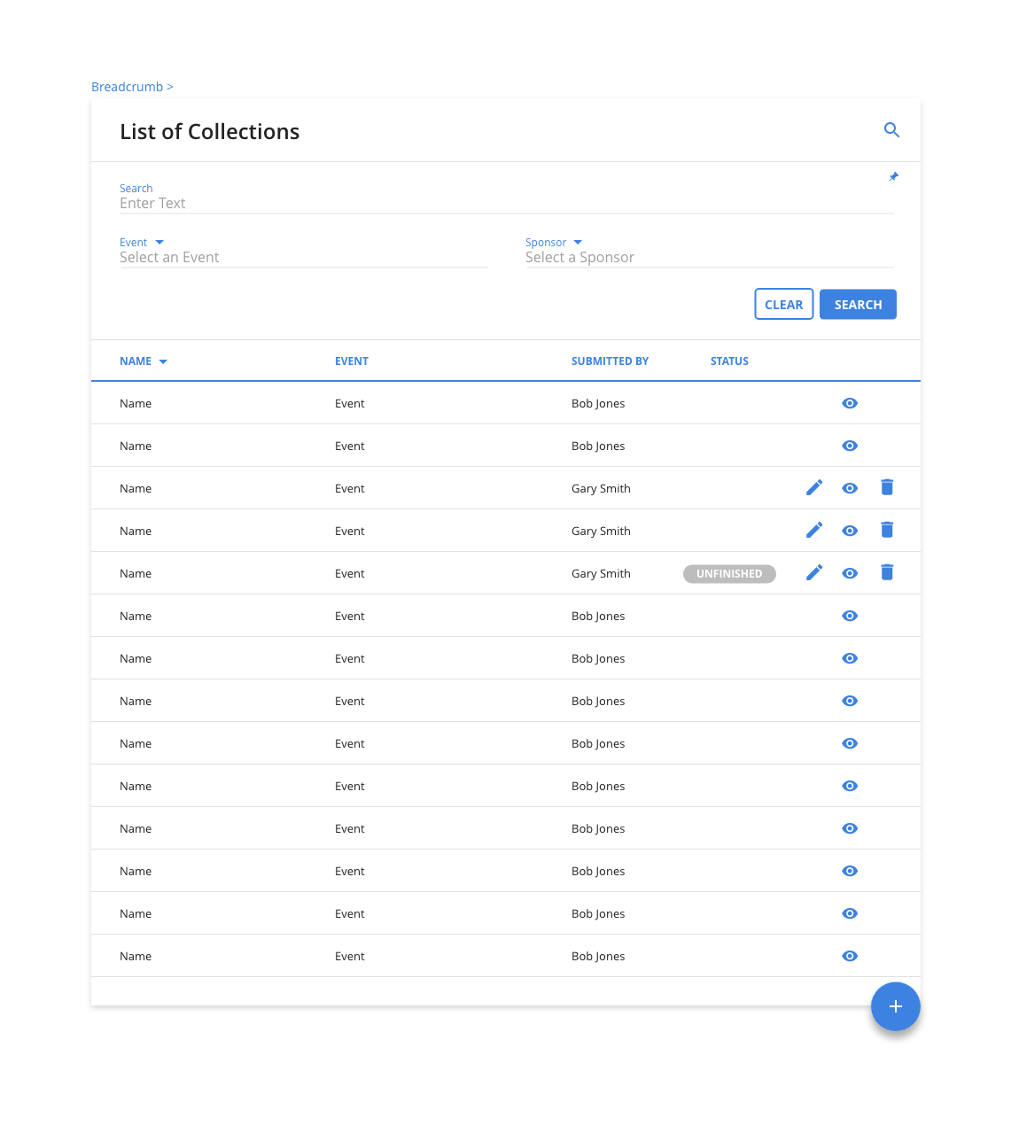
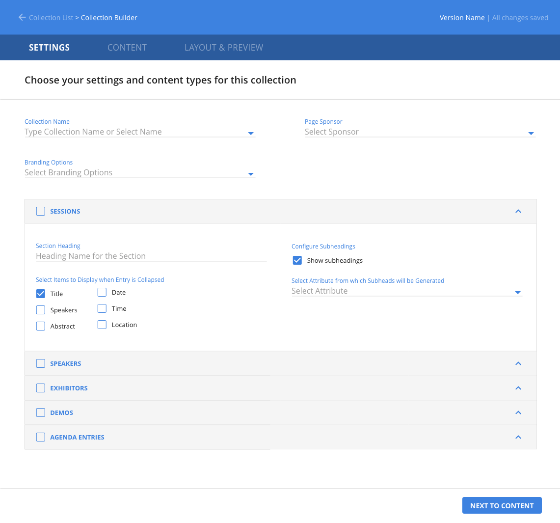
RAINFOCUS COLLECTION BUILDER
Summary
- Problem: Event managers lacked a flexible way to create and share structured event information.
- Goal: Design a tool to build custom collections and embed them via HTML/JavaScript.
- Role: UX designer defining and designing the collection tool for internal service teams.
- Process: Collaborated cross-functionally, iterated through sketches and wireframes, and delivered high-fidelity desktop designs in Adobe XD.
- Outcome: Provided a complete design for development; final results were not observed due to timing.
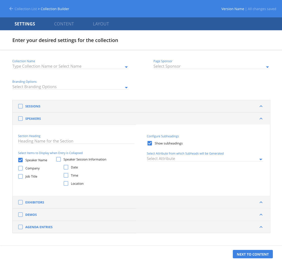
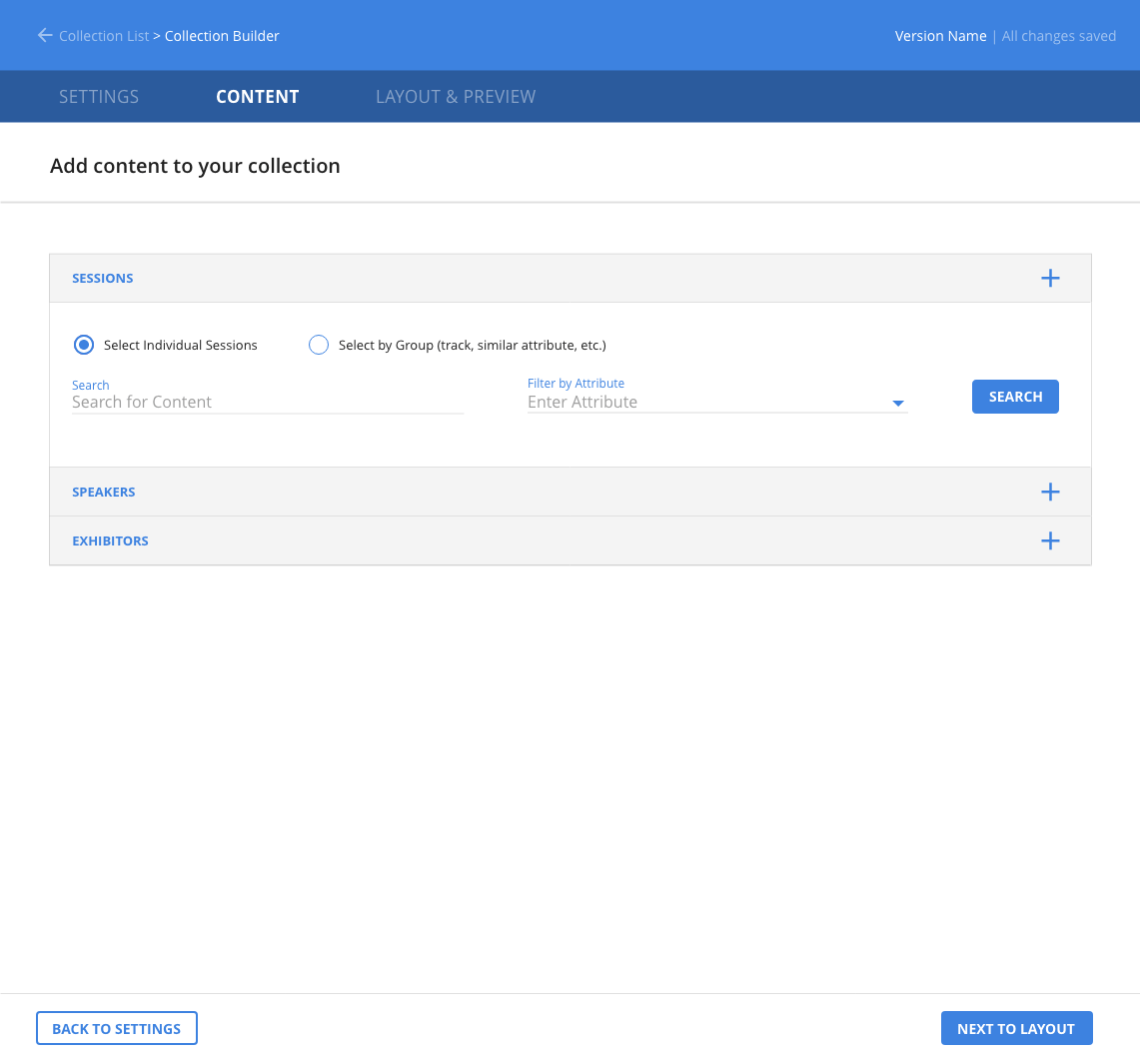
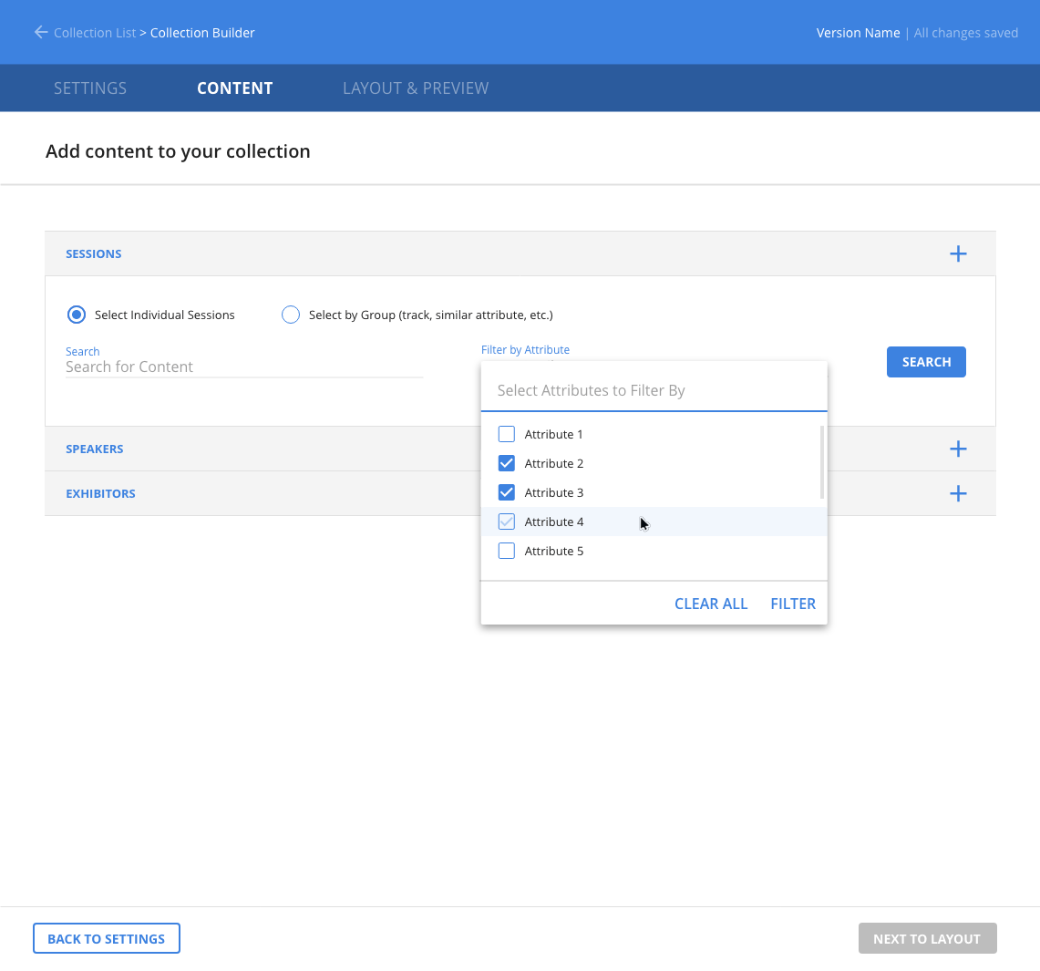
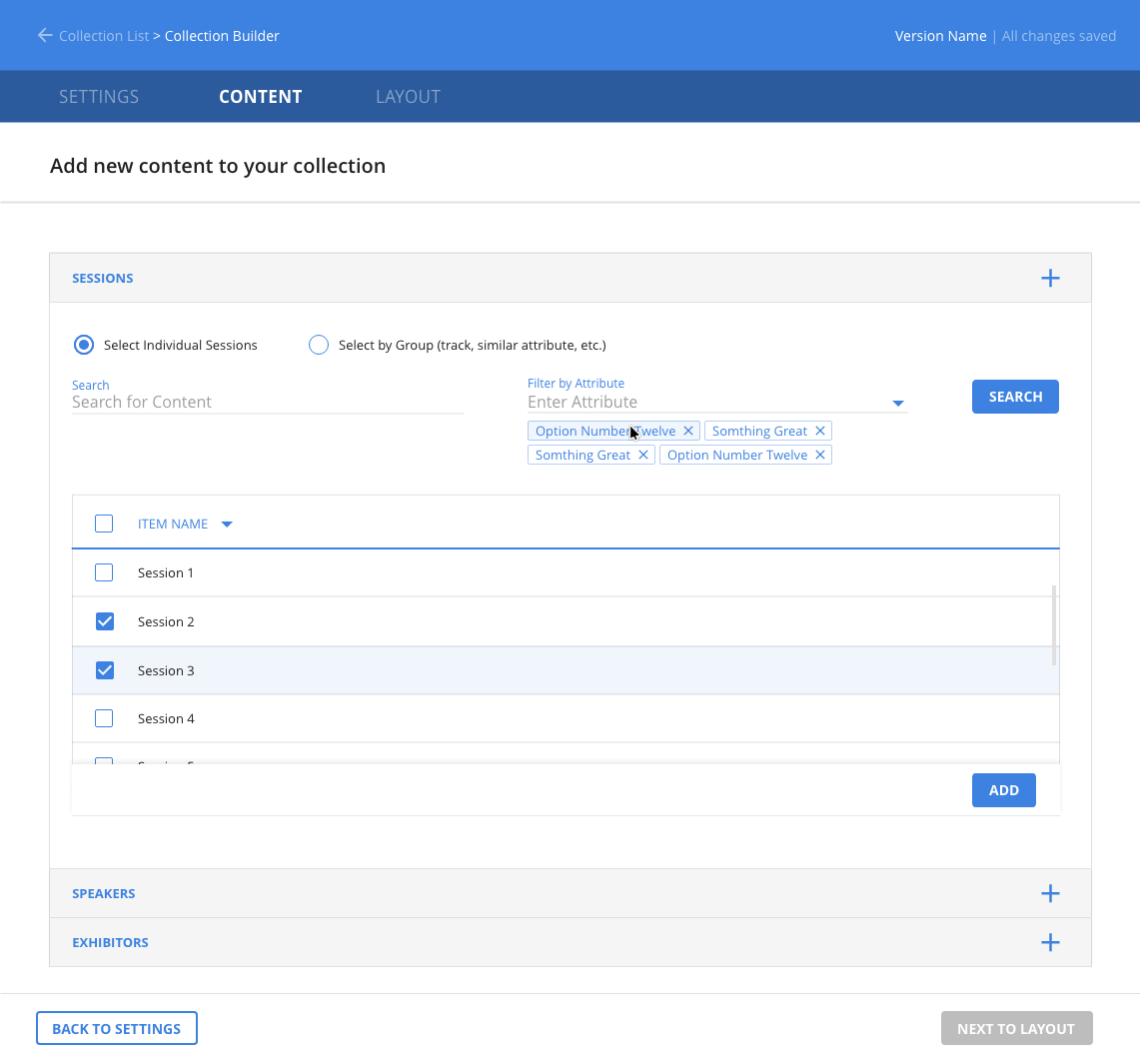
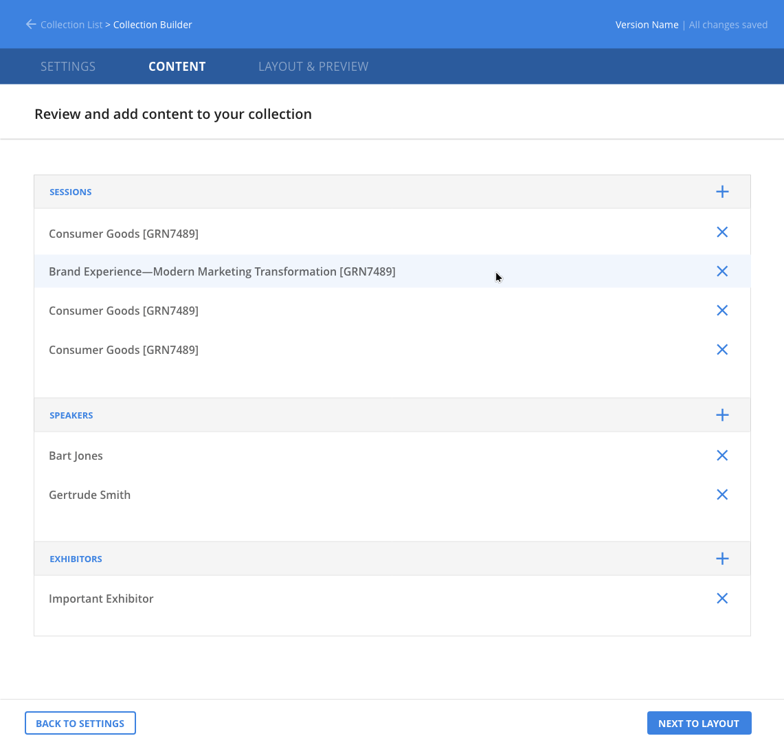
What was the problem to be solved?
RainFocus Company builds software tools for event managers. One need event managers have is to create information collections for attendees. Examples of these collections might include a catalog listing all sessions, all speakers at the event, and the times and locations of their presentations. Additional information collections might include exhibitors at the event, their demonstrations, and other miscellaneous activities such as special lunches, dinners, and presentations. With this project, RainFocus was developing a tool that would allow event managers to collect any grouping of information they wanted. The collection would then be output as HTML and JavaScript code, which could be embedded on a landing page or in an email.
What was my role on the project?
Since there was no existing collection tool, I was tasked with exploring options and designing one. Also, since RainFocus was handling all setup work for its clients at the time, its users were the in-house service team. Although event managers were the final audience, this service team became my target audience while working on the project.
What was my design process?
In consultation with the service team and its manager, I explored different options using initial sketches and journey maps. I also talked to the product manager and development team of this project to find out what was being discussed on their end and what the goals were of that team on this project. In addition I also consulted with other user experience designers in our office. After iterating several times with sketched wireframes and journey maps, I presented my ideas to the UX team, product team, and product manager. After several rounds of conceptualizing we finally arrived at a solution we thought would work. I was then given the task of designing a high-fidelity solution. Using Adobe XD I designed a solution for our desktop product and the development team began working on it. While I was at RainFocus our user testing processes had not been organized completely and so the high fidelity prototype I produced was not tested before development. The company also had promised to deliver the tool by a certain date and there was considerable pressure to release the product before testing could be done.
What was the outcome of the project?
I was assigned to do research on search engine optimization before the product was released and never got a chance to see the outcome of this project.
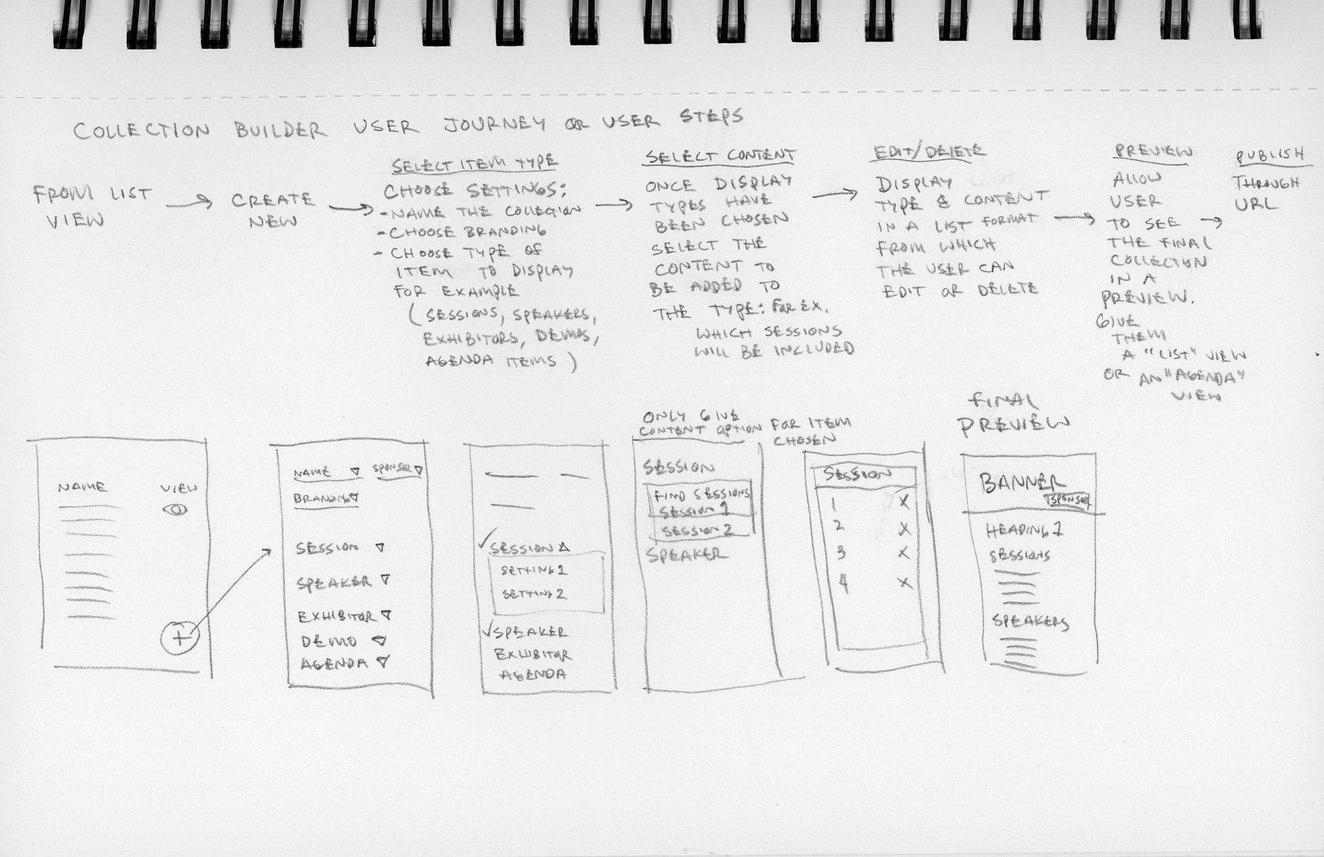
Add a Title
The concept began with a wireframe and journey map
Add a Title
The event managers name their collection and save it to this list
Add a Title
Event managers choose the type of online pages included in their collection
Add a Title
Accordion menus facilitate large quantities of information
Summary
- Problem: The service team relied on developers to create forms, catalogs, and registration pages.
- Goal: Enable the team to build embeddable forms and pages without developer support.
- Role: UX designer designing the widget builder tool.
- Process: Iterated with service, product, and engineering teams and produced high-fidelity designs in Adobe Muse.
- Outcome: Enabled a WYSIWYG form builder that significantly sped up page and catalog creation.
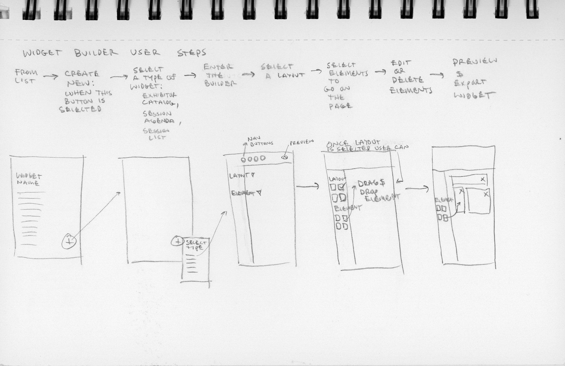
What was the problem to be solved?
Similar to the collection builder, the widget builder enabled RainFocus’s in-house service team to create a session or exhibitor catalog, a login page, or a registration process. The tool would enable RainFocus’s in-house service team to build forms and generate HTML and JavaScript code that can be embedded on a landing page, sent via email, or used on a registration kiosk.
What was my role on the project?
I was tasked with exploring options and designing a tool that would enable the in-house service team to create the forms they needed.
What was my design process?
Similar to the RainFocus collection builder, I explored different options with the service and production teams, as well as the UX team, through initial wireframes and journey maps. I also talked to the product manager and development team of this project to find out what their goals were for the product. After iterating several times with the sketched prototypes and journey maps the production team and I finally arrived at a solution we thought would work and I was given the task of designing a high-fidelity solution. On this project, Adobe XD was in beta form so I used Adobe Muse (Adobe’s website builder for designers) to design the high fidelity version.
What was the outcome of the project?
This product was in progress just as our UX team was developing a design system. The final product turned out differently than my design but the overall concepts of the tool—to give our service team the ability to make forms from a wysiwyg html editor—became a reality. The service team was able to generate catalogs, login pages, and registration pages much more quickly than they had before without the aid of programmers.
Add a Title
This concept began with a wireframe and a journey map
Add a Title
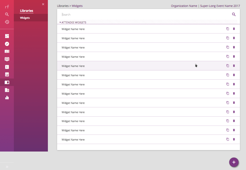
Event managers can select an existing widget or create a new widget
Add a Title
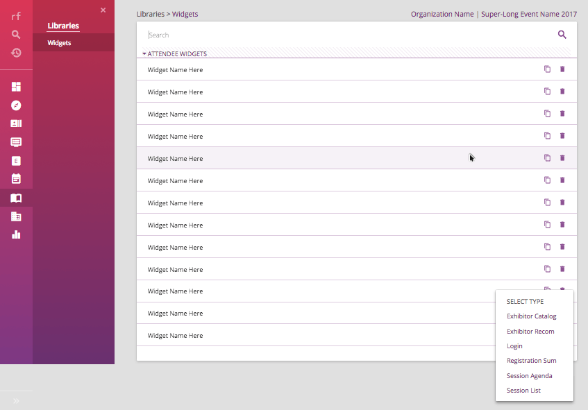
If a new widget is desired the event manager selects a widget type from an existing set of predesigned widgets

Add a Title
Once a type is selected a page is displayed where different elements of the widget can be chosen

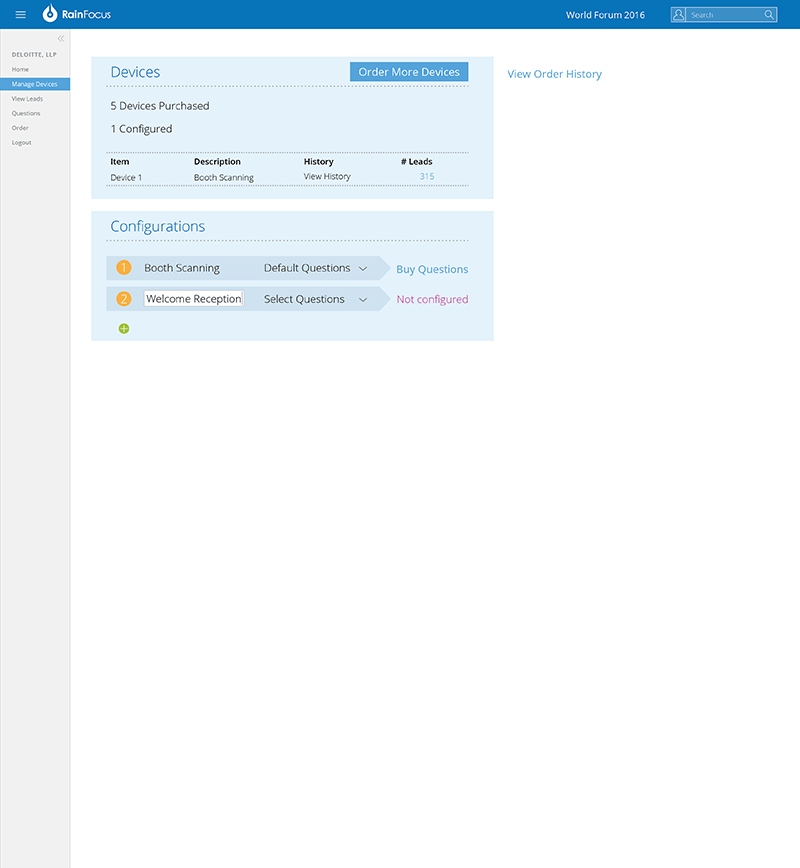
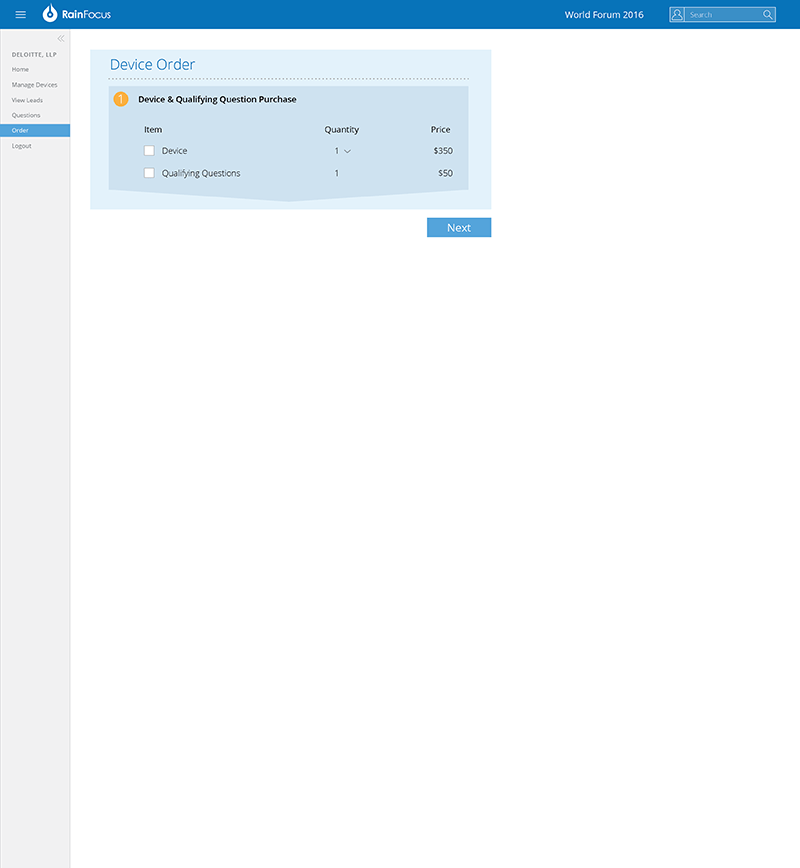
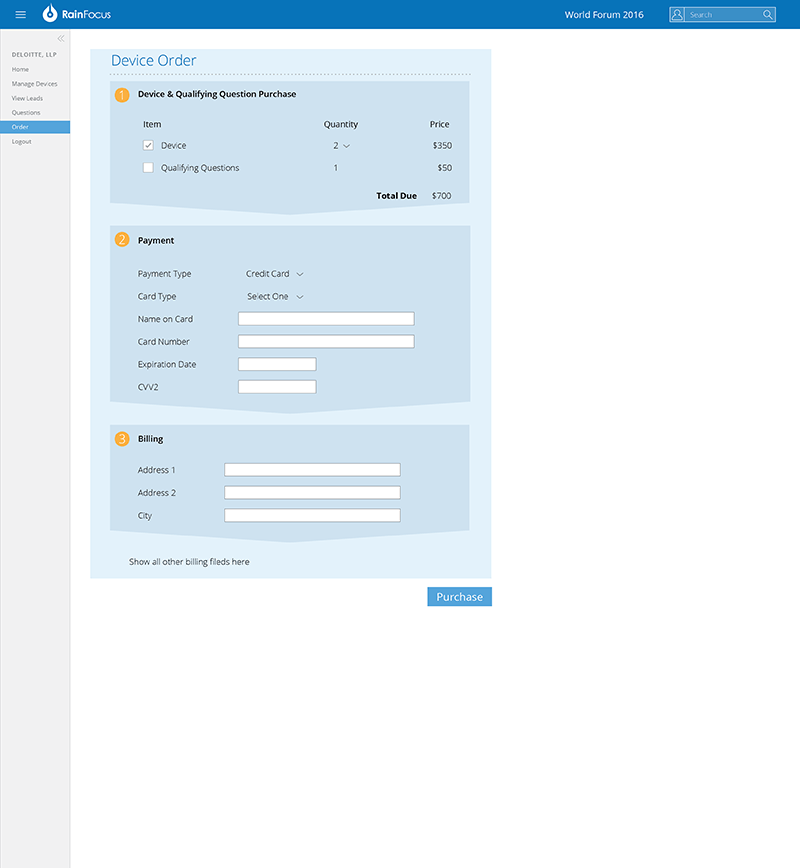
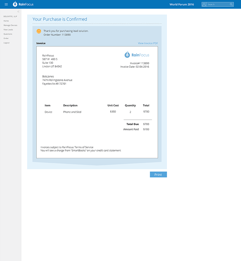
RAINFOCUS LEAD RETRIEVAL DEVICE ORDER FORM
Summary
- Problem: Exhibitors had no way to order lead retrieval devices or preset questions.
- Goal: Create a simple, efficient device and question ordering flow.
- Role: Lead UX designer partnering with the lead retrieval manager.
- Process: Designed wireframes from first principles, gathered service-team feedback, and delivered a high-fidelity prototype.
- Outcome: Enabled streamlined ordering and established lead retrieval as a key RainFocus service.
What was the problem to be solved?
RainFocus not only created event management software but also offered exhibitors the option to rent lead-retrieval devices (mobile phones attached to a scanning sled) with mobile software installed to communicate with event registration data. These devices gave exhibitors the ability to download preset questions as well as target particular segments of attendees that the exhibitors might be interested in. The company needed a way for exhibitors to order these devices.
What was my role on the project?
The lead retrieval manager and I were tasked with designing a process for exhibitors to order lead retrieval devices and preset questions. The questions would guide exhibitors in conversations with attendees at their booth and could be preloaded into the lead retrieval devices. I was the lead UX designer on the project.
What was my design process?
To understand the situation, I consulted with the lead retrieval manager. RainFocus was just beginning to purchase lead retrieval devices and they had never used any of these devices at a conference so they were starting from scratch and had no previous users who could be consulted. After brainstorming with the lead retrieval manager we presented several wireframes to the service team that would be implementing the use of these devices for their feedback. After receiving feedback from this group I was tasked with creating a high-fidelity prototype that could be implemented and used at our first small event.
What was the outcome of the project?
The lead retrieval device ordering process became much more streamlined after RainFocus had a way for exhibitors to order devices and preset questions. Lead retrieval device ordering and maintenance is now a significant service offered at RainFocus-supported events.